16 April 2025
When you fire up your favorite video game, have you ever stopped to think about the colors on your screen? That glowing blue on your health bar, the ominous red warning lights, or the soothing greens of a peaceful landscape—none of these colors are accidental. They’ve been meticulously chosen to make you feel something. In the world of game design, color isn’t just decoration—it’s a silent storyteller, a mood-setter, and sometimes, even a secret weapon.
Let’s dive into the fascinating psychology behind color choices in game design, and why these decisions go way beyond just looking pretty.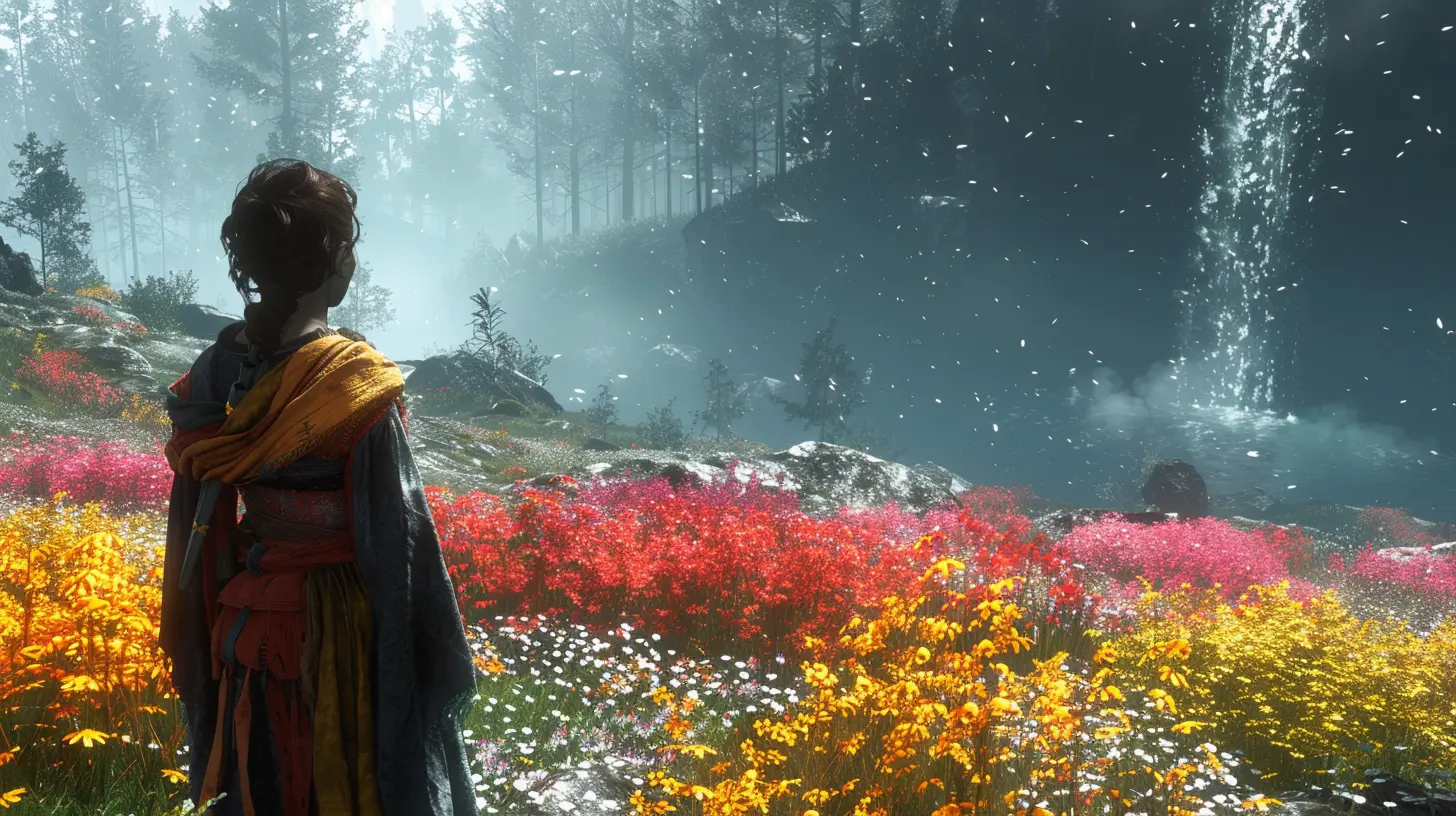
Why Color Matters in Game Design
Colors speak louder than words. Okay, maybe not literally, but you get the idea. Colors communicate emotions, guide players, and even manipulate their behavior (in a good way, of course). When designers choose colors, they're not picking randomly from a palette—they're crafting an experience.Think about it: the vibrant greens and blues of "Animal Crossing" create a sense of relaxation and escape, while the dark tones of "Dark Souls" fill you with unease. Color is like the background music of a game. You may not always notice it, but it’s constantly working behind the scenes to shape how you feel.
The Emotional Power of Colors
Ever notice how looking at certain colors can instantly trigger an emotion? That’s because humans are hardwired to associate colors with certain feelings. Game designers know this, and they use it to their advantage. Here's a quick breakdown of how some common colors affect us emotionally:1. Red: The Color of Action
Red demands your attention—it’s the color of passion, energy, and urgency. It’s no coincidence that danger warnings and low-health indicators in video games are almost always red. When you see red, your pulse quickens, and you’re on high alert. That’s exactly what designers want when they’re telling you, "Hey, your character’s about to die. Fix this NOW!"2. Blue: The Color of Calm
Blue is the chill color. It’s associated with peace, trust, and focus. That’s why you’ll often find blue used in menus, skill trees, or as a default UI color in many games. It helps keep you grounded, even in high-stress situations. Think about how soothing the blues and whites are in games like "Journey"—it feels like a deep breath for your soul.3. Green: The Color of Growth
Green screams "health," "life," and "nature." It’s the universal sign of things being okay. Health packs? Green. Safe zones? Green. It’s also tied to progress and growth, which is why RPGs often use green to highlight leveling up or improving stats.4. Yellow: The Color of Optimism
Yellow is cheerful, optimistic, and warm. It grabs attention but in a gentler way than red. In games, it’s often used to highlight interactive elements—like doors you can open or objects you can pick up. It’s the game’s way of saying, “Hey, look over here!”5. Black: The Color of Mystery
Black isn’t just the absence of color—it’s loaded with meaning. It represents mystery, danger, and the unknown. Games like "Limbo" use black to create a chilling, atmospheric experience that draws players deep into the game’s eerie world.
Color and Game Genres: A Perfect Match
Not all colors fit every type of game. Just like you wouldn’t wear a clown costume to a board meeting (unless you’re a professional clown), certain colors work better with specific genres.1. Horror Games
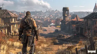
Horror games thrive on desaturated tones, heavy shadows, and muted colors. Why? They create a sense of dread and unease. You won’t find neon pinks here unless they’re dripping with blood—and even then, probably not. Games like "Resident Evil" and "Silent Hill" nail this aesthetic, setting the stage for fear by keeping you in the dark, literally and figuratively.2. Adventure Games
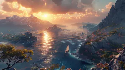
Adventure and fantasy games often use vibrant, eye-catching colors to immerse you in a magical world. Think of the lush greens of "The Legend of Zelda" or the playful pastels of "Super Mario Odyssey." These colors make the world feel alive and full of possibilities.3. Sci-Fi Games
When you think sci-fi, you probably think of glowing neons, futuristic blues, and metallic silvers. These colors scream "high-tech." Games like "Halo" and "Mass Effect" use this palette to transport players to the far reaches of the galaxy.
Guiding Players with Color
Colors don’t just set the mood—they’re also fantastic tools for guiding players. Game designers use colors as visual cues to help players navigate the game world and understand what’s important.1. Highlighting Objectives
Ever noticed how critical items or paths often stand out because they’re a different color? That’s not by accident. Designers use bold, contrasting colors to scream, "Hey, over here!"2. Establishing Hierarchy
In complex games with tons of information, colors help create a hierarchy of information. For instance, important enemies might be highlighted in red, while less threatening ones might fade into the background.3. Telling Stories
Colors can even act as silent storytellers. A once-lush forest that’s now grey and withered? That’s an instant visual cue that something’s gone terribly wrong. Without saying a word, the game communicates what’s happening in its world.Cultural Considerations in Color Choices
Here’s the thing about color: its meaning isn’t universal. What feels calming or threatening to one culture might mean something entirely different to another. In the West, white is associated with purity and innocence, but in some Eastern cultures, it's tied to mourning and death. Game designers creating for global audiences have to be mindful of these differences.Balancing Aesthetics and Functionality
Game design isn’t just about looking good—it’s also about functionality. Designers have to balance making a game visually stunning while ensuring it’s still playable. A beautifully colored game that strains your eyes or confuses you isn’t going to win any awards.This is where concepts like contrast and colorblind-friendly design come into play. About 8% of men and 0.5% of women are colorblind, and if a game relies too heavily on color cues without alternatives (like symbols or patterns), it can alienate a significant chunk of its audience.
Real-Life Examples of Brilliant Color Use in Games
If you’re still not convinced that color is a big deal in game design, let’s look at some standout examples.1. "Celeste"
This indie darling uses shifting color palettes to reflect the protagonist’s emotional journey. Warm tones highlight moments of triumph, while darker hues underscore feelings of doubt and fear.2. "Overwatch"
This hero shooter uses distinct color coding for each character and team, making it easy to identify allies, enemies, and abilities even in the heat of battle.3. "The Last of Us"
This game masterfully plays with color to tell its story. Vibrant greens reclaiming urban spaces hint at nature’s resilience, even in a post-apocalyptic world.The Takeaway
Color in game design isn’t just about making things look cool—it’s about crafting an experience. It’s the secret sauce that makes you feel connected to a game’s world, its characters, and even its story. Whether it’s calming you, thrilling you, or just making sure you know where to go, color is a powerful tool that designers wield with purpose.So, next time you pick up a controller, take a moment to appreciate the colors working behind the scenes. They’re doing more than you think.

Mistral Hurst
Color shapes emotions and engagement in gaming!
April 18, 2025 at 3:03 PM